
We have put together a list of the 15 best superhero symbols. Do you agree or disagree? Let us know in the comments.
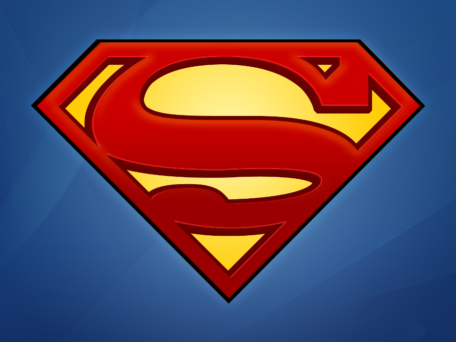
1. Superman
Arguably the most iconic of all superhero logos is Superman. Many say it’s the best superhero logo. It’s certainly one of the most recognizable with its eye-catching use of color, and diamond-shaped design to represent Superman’s power and strength. The letter “S” at its center clearly portrays that this represents Superman and nothing else. As logos go, it’s a clever combination of shape and color that makes it instantly recognizable.
2. Batman
Batman also has an easily recognizable logo tht incorporates yellow into the design. However, Batman’s story is more mysterious and darker, which is reflected in the other color choices in the logo. As you’d expect, the black bat represnts his dark nature and is instantly recognizable as an image of the character.

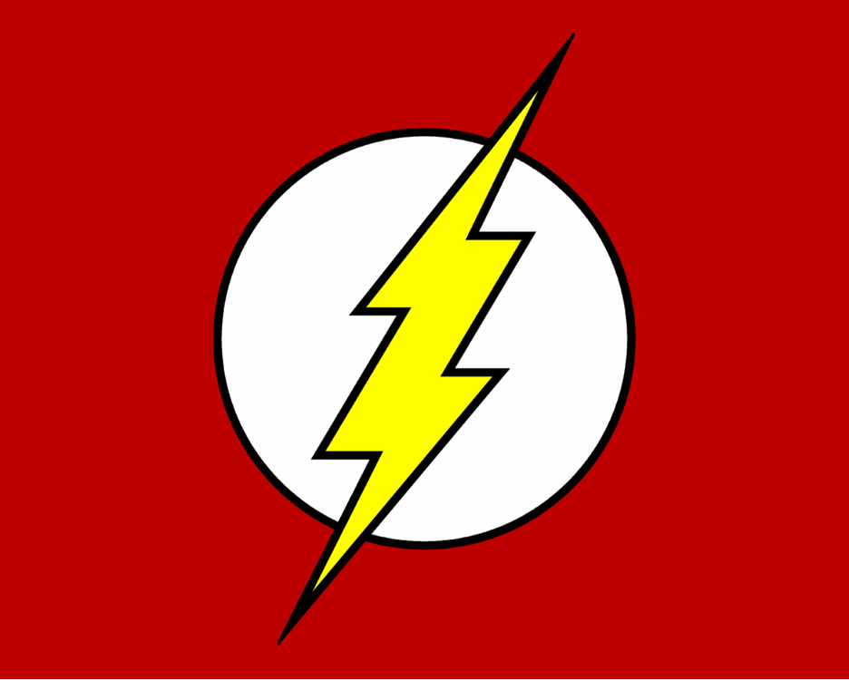
3. The Flash
The Flash runs quicker than lightning, which is represented well in his logo. Once again, we see bright yellow being incorporated into this catchy design as the lightning bolt strikes across the red and white. The Flash logo is bold, just like the character and represents his super-fast speed well. The white circle behind most of the lightning bolt really helps to accentuate it and make it pop. A circle is commonly used in logos to denote friendliness as it’s not harsh and sharp.
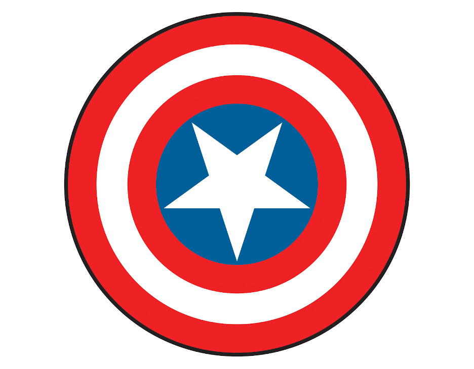
4. Captain America
The Captain America logo combines the American flag design and colors inside this superhero’s iconic shield. With bright colors and simple circles, the logo is a timeless one that is easily recognizable as belonging to its superhero. As mentioned above, the circles demonstrate friendliness, while the star at the center is a patriotic reference to his country.
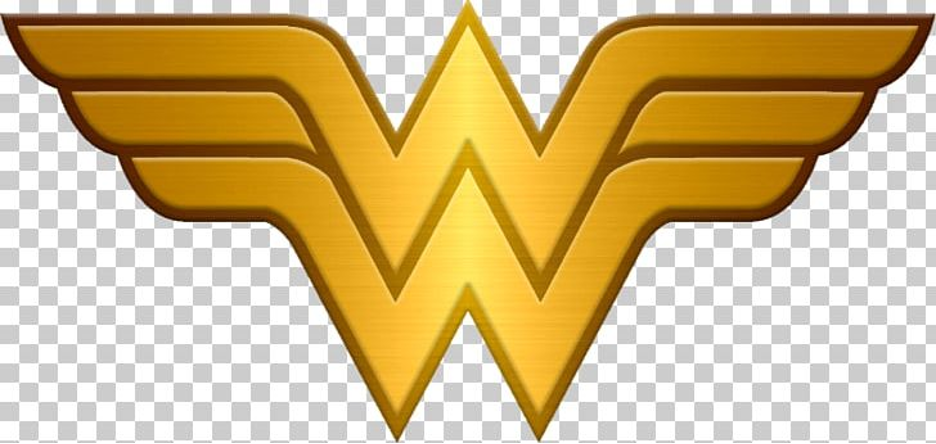
5. Wonder Woman
Arguably the most powerful of female superheroes, Wonder Woman’s logo is a clever design that incorporates the letters of her name with a design that mimics wings or a pilot’s epaulettes. This is a very fitting logo as Wonder Woman could fly in comic books. Once again, we’re presented with a bright yellowy gold design, which immediately draws attention to this Amazonian princess and warrior.
6. Spiderman
After receiving a bite from a radioactive spider, Spiderman (aka Peter Parker) was born. Spiderman gained the spider’s powers and was able to cast webs and jump from place to place. While Spiderman’s logo has changed over the years, it has always incorporated a spider, as you’d expect.
Since spiders are often feared, especially among children, the Spiderman logo appears more friendly-looking and rounded when used for kids. However, in comics that were darker, the logo and image had sharper edges. No matter the image used, it’s clearly recognizable as the logo for Spiderman.
The spiderman logo has always been on the center of spiderman’s chest. The spider is a symbol of agility, power, protection, and mystery.

7. The Green Lantern
The power of a Green Lantern is all in his ring and it’s easy to see this represented in this super hero emblem. The Green Lanterns were the good guys in the DC Comics. The Green Lantern logo represents the lantern with the ring in the middle, giving it power. It’s a straightforward superhero emblem design and it’s easily recognizable too.
Despite green being a color of peace and ‘good’, it’s not used for superheroes, which sets the Green Lantern superhero logo apart from other logos.

8. Iron Man
The logo for Iron Man is a basic, yet memorable super hero insignia. There are different versions of this logo but all use distinctive identifiers for Iron Man himself. In Marvel Comics, you most often see an Iron Man helmet outline, while The Marvel Cinematic Universe uses the arc reactor symbol as its logo. The arc reactor is the greatest invention by Tony Stark since it powers his suits and keeps him living. The arc used in the logo represents this superhero and everything he does.

9. The Punisher
Unlike a lot of superheroes, The Punisher doesn’t have a problem killing off the bad guys to avenge the dealth of his family members. This superhero is an ex-soldier. His emblem frightens off his enemies and it’s no surprise why! This black and white skull image with long teeth is both eye-catching and terrifying.

10. Daredevil
During his childhood, Daredevil was involved in a car accident and developed special abilities as a result. Though blinded by a substance falling out of a truck, Daredevil’s exposure to radioactivity means his other senses are heightened beyond normal and he has a “radar sense. As a result, Daredevil fights crime and is a warrior and risk-taker. The Daredevil logo fits perfectly with the red denoting violence and a flame effect to add to the impact.

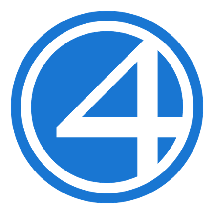
11. The Fantastic Four
Combining four heroes in one logo is tough so the Fantastic Four logo maker took a simple approach. Since the strength of the Fantastic Four comes from their abilities combined, the number 4 is important in the emblem. The blue color represents their suits as well as their calm personalities too.
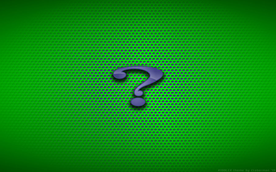
12. The Riddler
Ok so The Riddler isn’t actually a superhero but we thought his logo was still worth a mention as it’s a cunning design (much like The Riddler himself). The use of the question mark represents this villain’s desire to make unsolvable riddles and traps, while the green color adds to the mystery.
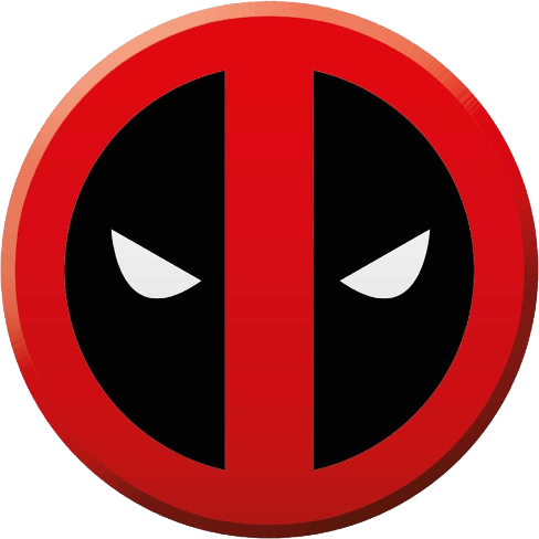
13. Deadpool
Deadpool’s ability to heal means he’s not afraid to run into danger headfirst and get into bother. This superhero jokes that the color of his suit is to avoid showing bloodstains. With red used in the logo, we can see his character well represented. The spooky white eyes make the audience feel as though he’s looking directly at them and mimics how this superhero breaks the 4th wall in the movies and comics too.
14. Black Panther
One of the most popular Marvel superheroes is Black Panther and the Black Panther logo hasn’t changed a lot over time. Rather than using words, the logo of this superhero is his famous mask, which makes it recognizable instantly. This superhero logo certainly packs a punch; it’s simply yet impactful.

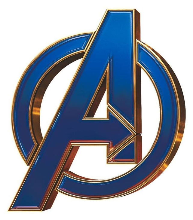
15. The Avengers
Another team logo, this time using the letter “A” to represent these superheroes. The incorporated circle portrays their untied front and, on careful inspection, you’ll notice there’s an arrow clearly beckoning them to fight crime.
Final Thoughts
As you’ve seen in this superheroes logo list, there is something unique about each design – whether it’s shape, color, or use of words or letters. While for entertainment purposes only, designers of superhero emblems really know how important branding is too. The best superhero logos are memorable and distinctive with good use of color.
When using a logo maker, you need to consider what you want to portray in your logo and what brand characteristics you want to get across to your audience. If you combine different elements of design like shape and color, you can create an original logo that tells your unique story.
Lukas is part of the content writing team at GraphicSprings, bringing his marketing expertise to the forefront. With a degree in Marketing, he crafts informative articles on social media, branding, and logo design.