
Your logo is a very important part of how you represent your business to the world. Having a great logo can bring in clients and help you create an identity that people know and respect. Thankfully, there are many different types of logos to choose from when designing your own logo. These different logo styles allow everyone to have a unique and individual logo that represents their company well.
The top 4 logo types are Wordmarks, pictorial, mascot, and combination. These are the most talked about and are commonly used. However, there are a total of nine great types of logos. Keep reading to learn more about all of them.
1. Lettermarks or Monogram
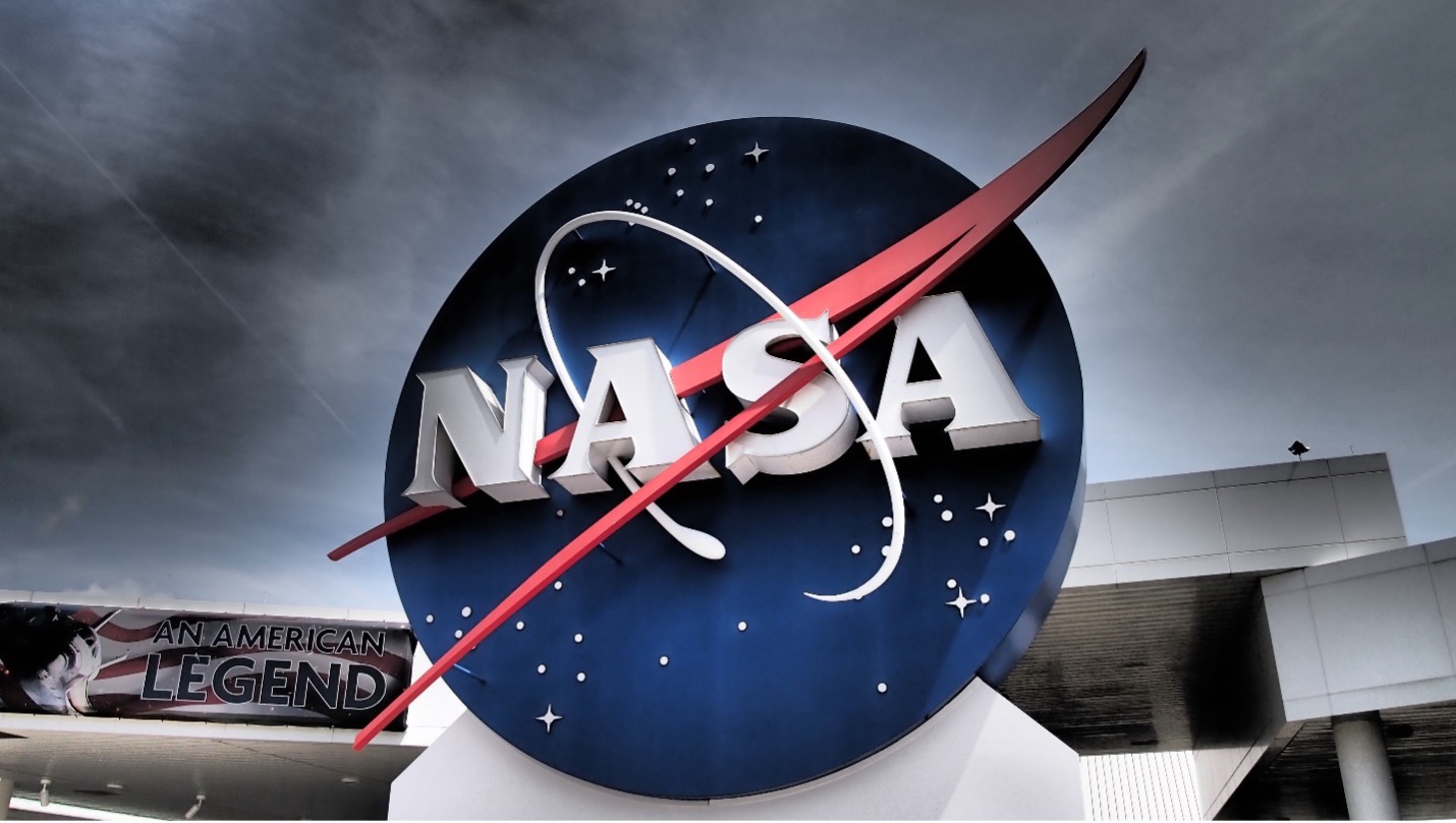
One of the major types of logos is lettermarks or monogram logos. These logos are defined by only using letters. Normally they will come in twos, threes, or fours and be the initials for the company. Rather than have their entire name represented, they use their initials as their logo. Because of this decision, these companies are known by their initials rather than their full names.
Examples of this are IBM, NASA, HP, CNN, and ESPN. IBM stands for International Business Machines. NASA stands for National Aeronautics and Space Administration. HP stands for Hewlett-Packard. CNN stands for Cable News Network. Last, ESPN stands for Entertainment and Sports Programming Network.
Using a lettermark or monogram logo is a great choice if your company has a long or strange name. HP sounds better and is easier to say than Hewlett-Packard. Using initials can help catch the audience’s attention and be easier to remember.
2. Wordmarks
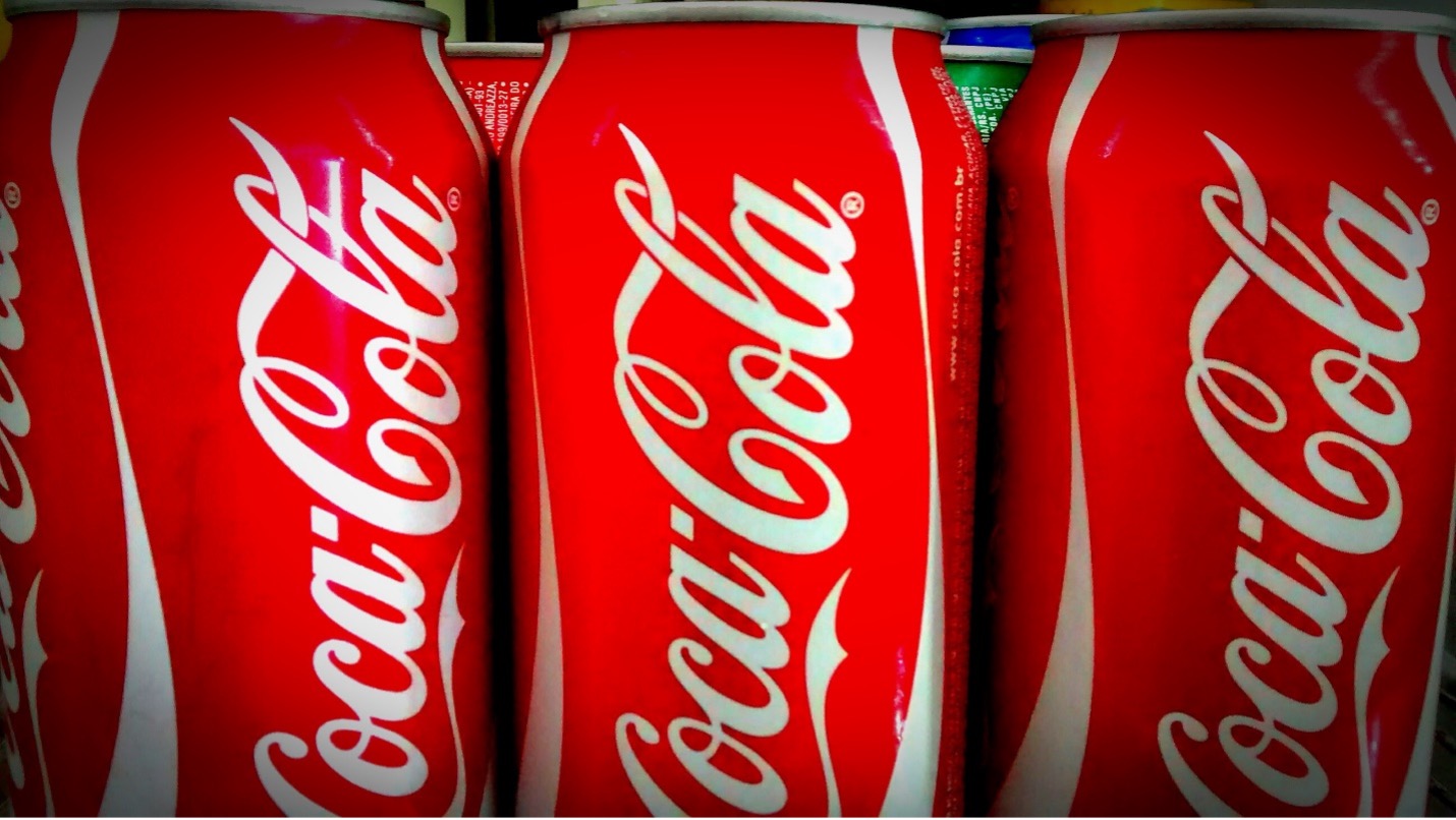
Another one of the major types of logos is the wordmarks. These are logos that are only made of words. It is very inspiring and memorable if you are able to pull one of these very difficult logos off. The reason that they are hard to do is that they are long and require the audience to read them. They are not simple images but one or more words. Having a great wordmark logo means that you are able to interest your audience into looking for more than just a moment.
Examples of this logo are Coca-Cola, Google, FedEx, Tiffany & Co., Johnson & Johnson, and eBay. None of these logos use images or icons of any kind in their logo. While Coca-Cola does have the polar bear mascot, they don’t use it in their logo, so they still fall into the wordmarks category.
Using a wordmark logo is a great choice if you have a very bold and memorable name. All of these names are unique and are not confused with other companies. Just by thinking about their name, your mind already begins to recall what they are known for, what items they sell, or their target audience. You probably don’t want to go with a wordmark logo if your company’s name is difficult to read or say out loud or if it isn’t unique at all.
3. Letterforms
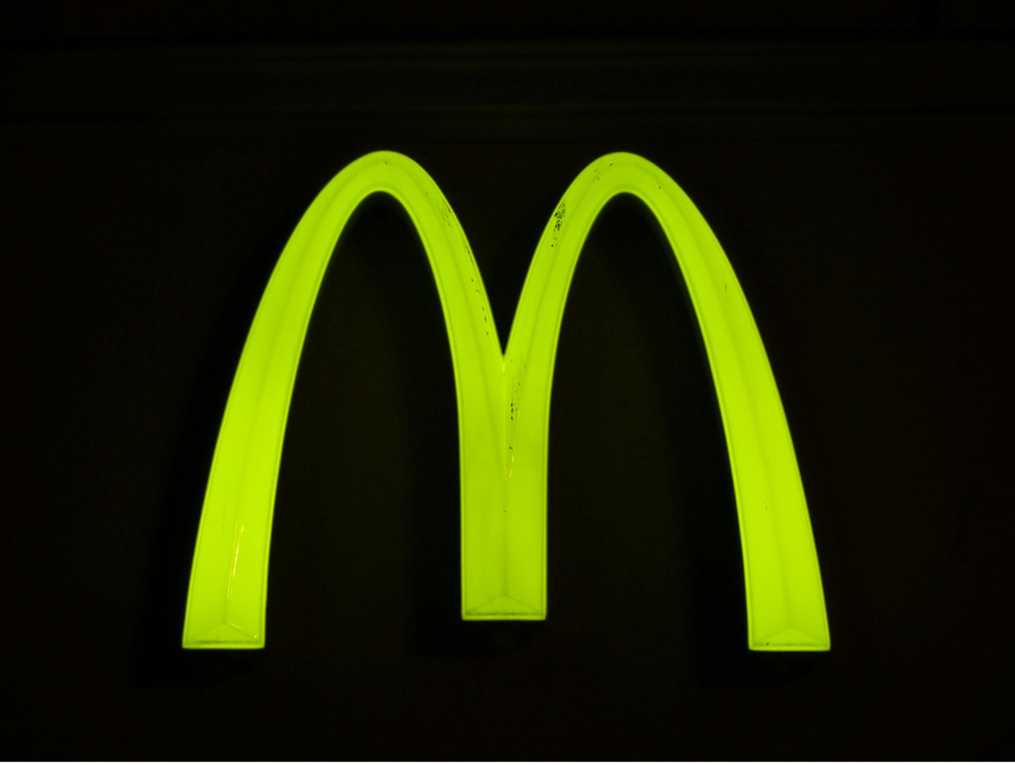
These types of the logo are defined by only using a letter. Companies that can pull off letterform logos hold a lot of power. Having consumers be able to recognize a single letter that is designed a specific way just shows how memorable they are. Consumers don’t need to read the entire name in order to think about the company and its goods.
Examples of this logo are McDonald’s, WordPress, Adobe, and Netflix. The yellow arches are one of the most identifiable examples of letterform logos. For consumers, this logo holds a lot of meaning, evening though it is simply a yellow letter ‘M’. These types of logos allow the first letter of their company name to do all the speaking for them.
Letterform logos are risky because if the audience doesn’t recognize them, they have no way to look it up and see what the company is, whereas a wordmark logo doesn’t have this problem. However, if your company is well-known enough for this, it can be very powerful and bold to be just represented by a single letter.
4. Pictorial or Brand
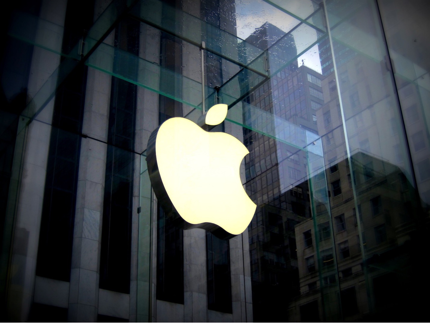
One of the most memorable logotypes is the pictorial or brand logo. These logos are represented by just an image or icon. These images are typically tied to the company’s name or an important aspect of the company. This allows viewers to make a direct mental connection between the two. The images are easy to understand and the references are not difficult to make.
Twitter, Apple, Target, Playboy Enterprises, and John Deere are all good examples of pictorial or brand logos. Twitter has a bluebird that connects with the tweets posted on Twitter. Apple, the company, uses the image of an apple. Playboy Enterprises has a bunny. Last, John Deere has an image of a deer surrounded by a green shape which connects with the company name and with their classically colored green tractors.
Having a pictorial logo means simplicity. There are no words or letters involved which can allow your logo to be easily understood. The main downside to brand logos is if the audience doesn’t recognize them. They will have a much harder time learning more about your company because they didn’t make the connection. The main thing to make sure, of when creating a pictorial logo is that it is easy to make the connection. That is why most companies decide to have the picture represent their actual name, such as with Apple and their apple or Target and their target.
5. Abstract
One of the main styles of logos is abstract logos. These types of logos fall under the pictorial logos but they are more specialized. These logos are images but instead of exactly describing the company, they are abstract images that, before being used, had nothing to do with the company.
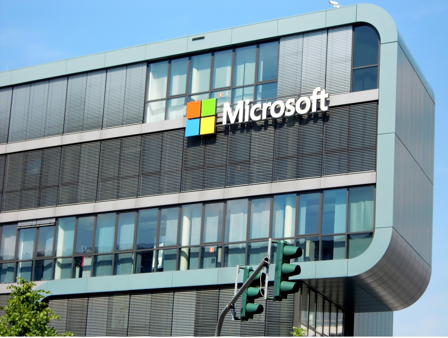
Spotify, Pepsi, Nike, Chase, Microsoft, and BP are great examples of companies that use abstract logos. All of these companies utilize different shapes to represent themselves. There are different colored circles, triangles, and other shapes. These logos are the hardest to recognize on their own because they have nothing to do with their company.
Using an abstract logo allows you to have a lot more freedom than some of the other options allow. These types of logos are not restricted to whatever the company name is. Instead, they allow designers to get creative and think of something out of the box. For these companies, this method really paid off.
6. Emblem
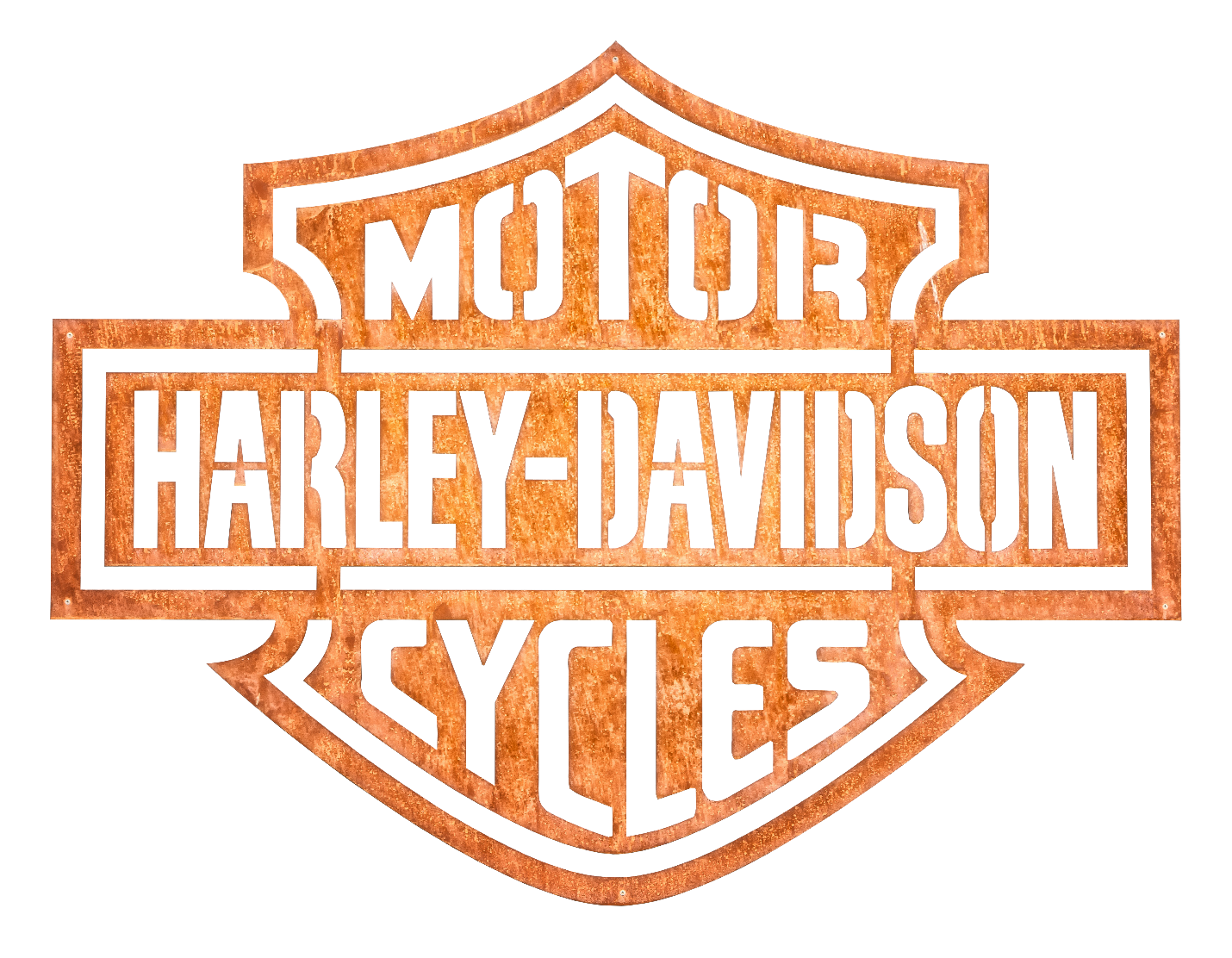
Emblem logos are important logo types. These logos are designed around a shape that makes the design look more like an emblem. There are many reasons why a company might want an emblem logo, but overall, it gives a visual tie to old family crests and more.
Warner Bros. Pictures, Harley-Davidson Motorcycles, NFL, and Starbucks all utilize emblem logos. Warner Bros combines its emblem with its initials in order to create its logo. Harley-Davidson opts for using its full name in the logo. NFL sticks with their initials for their logo. Starbucks is the only example here where they created an emblem logo and did not use any words or letters. They rely on just their unique icon in order to be recognized.
A lot of design work has to go into emblem logos in order for them to look their best. While some other types of logos can be created by individuals with little graphic design experience, emblems require more work. Emblem logos provide a lot of information and sometimes, very small details within their design. It can be hard to be successful with this difficult type if you are not a well-seasoned designer. But if you can create a great emblem logo, then this can be a very good option.

7. Combination
Combination logos are some of the most common of the different logo styles. These logos use both the name of their company and an icon to get their desired look. The reason why these types of logos are so common is that you don’t have to rely on just the image or just the words in order to gain clients. Having both elements is also very helpful for companies that are not as well established or heard of.
Burger King, Pizza Hut, Sonic, and CVS pharmacy all are great examples of combination logos. Burger King has their name within the shape of a burger. Pizza Hut adds a hat shape on top of their words. Sonic incorporates their triangular arrow shapes behind their word. CVS pharmacy has a heart shape right in front of their words. For each of these designs, their icons relate to their identity, but it is also incorporated with the words. The two elements work together to create a great design.
As stated before, combination logos can be easy to make and great for companies who are just getting off their feet. It is important that the elements work well together and don’t make the composition awkward at all. A great combination logo can be very powerful and feel like one cohesive unit.
8. Mascot
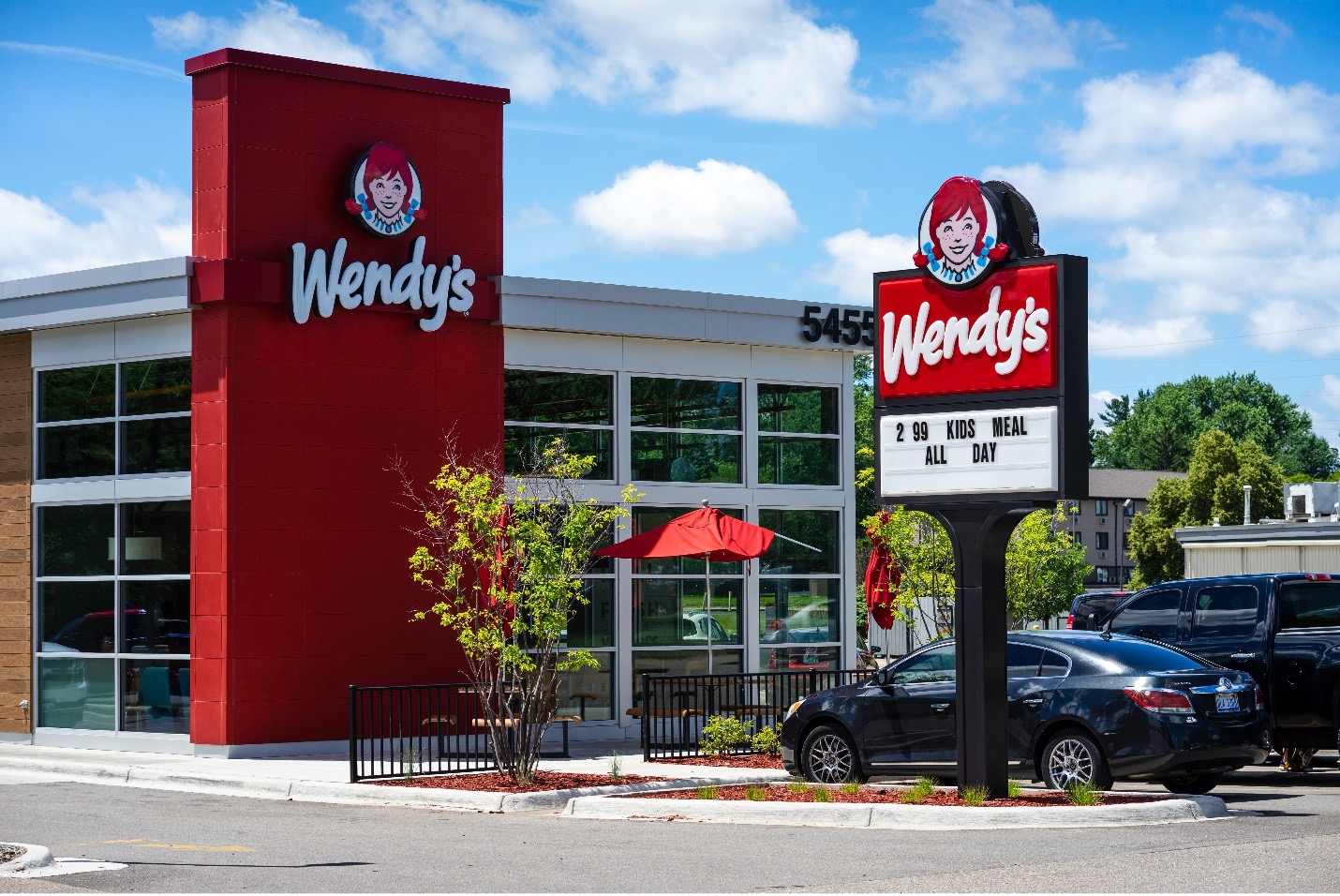
One of the different logos is mascot logos. These logos are as described. They might have their names also mentioned, but they are almost exclusively defined by the mascot that the company has created for them. Most mascot logos are targeted at children or have to do with food. Having a relatable or funny mascot can make your product more desirable.
KFC, Pringles, Wendy’s, Quaker, and Michelin are some examples of different logos that have words and mascots combined together. For Wendy’s, the mascot is also the name of the company. All the other company names are more descriptive of the items they are selling rather than of their mascot. All of the mascots relate to the goods in some way or another.
If you want to go the route of mascots, make sure to take plenty of time to think of a unique character. You want your mascot to be recognizable amongst the crowd and not be confused with anything else. While these logo examples included their names with the image of their mascots, this is not required for your logos. The main benefit of having both your name and the mascot together is that if people don’t recognize one, they will hopefully recognize the other.
9. Dynamic
Dynamic logos throw a spin on the previous types, logos, and mascots previously mentioned. Dynamic logos take a single idea and expand on it, changing a part of their logo based upon a change within their company. This type is the least used of all the types of logos because it can be a little time-consuming and difficult to pull off.
Noggin, Nickelodeon, and AOL all demonstrate dynamic fonts. They have different logos displayed with small changes to color, shapes, and more within the design. They do, however, keep a part of the logo the same, allowing it to be recognized.
Let’s review Nickelodeon to understand dynamic logos better. They have many different designs of orange shapes behind their Nickelodeon name. These designs are always different, and yet the audience still knows that it is still the same company and group. Keeping the placement and color of ‘Nickelodeon’ and keeping the shape orange is very important in order for the audience to make that mental connection.
Choosing a Type of Logo
Having nine different types of logos is great until you have to decide on the types of logo design that you want to implement for your company. Take a look at the different types. Do any of these types stand out to you? Some companies are betters suited for certain types than others. You and those who work with you are in the best position to decide what will represent your company best.
Your first decision should be if you want to incorporate your name or an image into your logo. Take a look at your company name, is it memorable? Is it easy to say and write? Having a name that is difficult to spell correctly will make it difficult for your audience to look you up.
Is your name very long? It might be possible to use your company’s initials in your logo. If that doesn’t work, you could always isolate the first letter and go from there. If you do decide to represent your company’s name in a shorter version, make sure that it makes sense and still connects well to the full name.
Is your company name already related to an image that you could easily use as your logo? If you named your company after an item or a person, then the answer to this might be yes. If not, you still might be able to come up with an icon that represents you well, but it might be more difficult. If you would like to use an icon in your logo, but there is nothing related to your name, you can always go with an abstract icon instead. Your possibilities are endless when it comes to this type. Abstract shapes can be anything you want them to be and they can easily be very unique from anything else out there.
Perhaps you need a combination of words and icons? A combination logo can help to tie everything together and makes up for consumers that might forget your name or icon. If you decide on a combination logo, you are able to separate the elements and use them individually. However, you will have the most success when you keep them together if that is how you designed them.
Dynamic and emblem fonts are harder to pull off until you already have some design skills. If you are interested in one of these logo types, it might be beneficial to talk with a professional in the field to have them help with your design process.
The last type to consider is the mascot logos. These logos only work if your company has a mascot. The mascot could be based on an actual person, or it could be an imagined creature. If you already have a mascot, then this will probably be the best way to go. People enjoy forming attachments and then seeing those attachments. Having your mascot represent you is a great way to go.
In order to help make a final decision, write down your favorite types that will work best for your company. Then start doodling some images and thoughts about your logo. What do you want your logo to look like? If you get stuck or are having trouble, it can always help to talk with someone else. Even if that person is not involved with your company, they might still be able to give you helpful advice.
Overall, you want your logo to appeal to your target audience and consumer base, no matter what type you choose. Different types can give off different feelings or make your audience think of specific things. Having a logo that your consumers enjoy is the ideal way to go. Your logo is there to attract them to you and your services. If your logo is unmemorable, this will not be the case.
Once you have your logo, you are able to edit it and change it throughout the years that your company is established. However, you want to try and keep it very similar to the original logo so that your audience isn’t thrown by the change and they are still able to recognize your logo. Changing your logo too much overtime can cause some confusion in your target audience.
Are you ready to get started creating your very own logo? Using our logo maker at GraphicSprings, you can have your very own logo after just three steps. You will get to have a hand in determining what type of logo you want to use. Our logo maker is affordable with an easy-to-use platform. No classes or fancy skills are required to get started today.
Ready to Get Your Logo?
Lukas is part of the content writing team at GraphicSprings, bringing his marketing expertise to the forefront. With a degree in Marketing, he crafts informative articles on social media, branding, and logo design.